 By Nick Quirk
October 6, 2026
9 min read
By Nick Quirk
October 6, 2026
9 min read
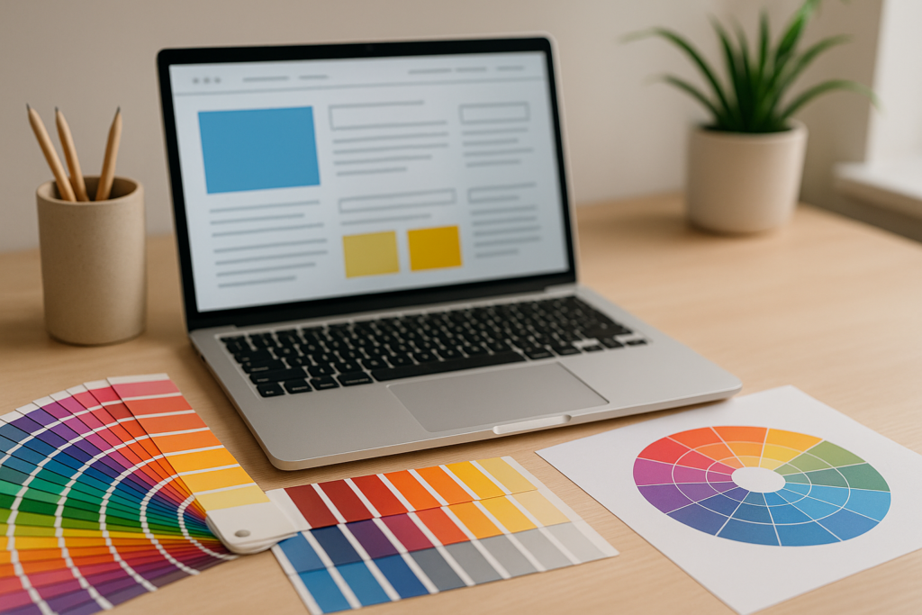
Color influences conversions far less through hidden emotional triggers and far more through contrast, hierarchy and legibility. The psychology of color in web design and conversions is real, but in most documented A/B tests a button color change moves conversion rate by a few percentage points at best, while a clearer visual hierarchy can move it much further. Understanding that difference saves you from repainting your site every quarter chasing a myth.
What follows is the practical version: what colors tend to signal, how to build a palette that directs attention, the contrast numbers that keep your site readable, and how to test changes without fooling yourself with noisy data.
Color Works Through Contrast, Not Inherent Meaning
The single most reliable finding in color research for the web is the isolation effect, often called the Von Restorff effect: an element that differs visually from everything around it gets remembered and clicked more often. A green “Buy Now” button performs well on a page of greys and whites, and performs terribly on a page already painted in soft greens.
This is why the famous “red beats green” test results contradict each other across studies. In each case, the winning color was simply the one with the most separation from the surrounding page, not the one carrying the right emotion.
Before you touch your palette, look at a squinted screenshot of your landing page. If your primary action does not jump out when the details blur, no amount of color psychology theory will rescue that page.
Where the “Blue Trust” Idea Came From, and What It Leaves Out
Blue dominates banking, insurance and SaaS interfaces because survey research consistently shows blue as the most widely liked color across genders and cultures, with associations of calm, stability and competence. The blue trust connection is genuine as a preference pattern, yet it is weak compared to signals like review counts, pricing clarity and page speed.
Research summarized by the Nielsen Norman Group points the same direction: color aids comprehension and grouping, while meaning comes mostly from context and convention rather than the wavelength itself. A red badge reads as “error” on a form and “sale” on a product grid.
Treat color associations as a tiebreaker between two otherwise sound options, not as a conversion strategy on its own.
How Common Colors Tend to Read Online
These associations hold reasonably well for Western, English-speaking audiences, and they shift once you cross borders. Use them as starting hypotheses:
- Blue: stability, security, professionalism. Heavily used in finance and B2B software, which also makes it forgettable in crowded categories.
- Red: urgency, clearance, warning. Effective on limited-time offers, risky as a dominant brand color for health or legal services.
- Green: growth, affordability, environmental claims, and “go” in interface conventions. Also the default confirmation color, so a green CTA can blend into system messaging.
- Orange and yellow: energy and friendliness at low cost. Orange is a frequent CTA accent because few brands use it as a base color, which gives it natural separation.
- Black and charcoal: premium positioning, fashion, luxury automotive. Needs generous white space or it reads heavy.
- Purple: creativity and a slight premium lean, common in beauty, wellness and newer tech brands.
Notice that none of these promise a conversion lift. They set expectations before a visitor reads a single word, which matters most in the first two or three seconds on the page.
The 60-30-10 Split That Keeps a Palette From Fighting Itself
A workable web palette uses roughly 60% dominant neutral (often white, off-white or a dark base in dark mode), 30% secondary brand color, and 10% accent. That last 10% is the budget you spend on actions.
The rule that actually protects conversions: the accent color appears nowhere except interactive elements. If your accent orange also decorates section dividers, icons and pull quotes, the button loses its claim on attention.
Most sites need two brand colors plus two or three neutrals. Anything beyond that tends to produce pages where every section competes for the same eye movement.
Making the Primary Action the Loudest Element on Screen
Pick one primary action per screen and give it the strongest color weight available. Secondary options, such as “Learn more” or “Compare plans”, should drop to an outlined or text-only treatment so the visual hierarchy matches the business priority.
A few specifics that consistently matter more than hue choice:
- Keep tap targets at least 44 by 44 pixels so mobile users do not mis-tap neighboring links.
- Give buttons a visible hover and focus state, with a focus outline that stays visible for keyboard users.
- Repeat the same CTA color on every page of a funnel so returning visitors recognize the action instantly.
- Avoid gradients on small buttons, where they reduce effective contrast against the background.
Color is a delivery vehicle for the words inside the button, which do the heavier lifting. If the label is vague, see how to write call-to-actions that get clicked before testing a new shade.
Contrast Ratios and the People Who See Color Differently
Accessibility and conversion point the same way here. The W3C contrast guidelines call for a ratio of at least 4.5:1 between body text and its background, and 3:1 for large text (18pt, or 14pt bold) and for interface components like button borders and form fields.
Light grey text on white backgrounds, still common in modern design, often sits near 2.5:1 and quietly costs you readers over 45 who need more separation to scan comfortably.
Color vision deficiency affects roughly 1 in 12 men and 1 in 200 women, mostly red-green confusion, according to the National Eye Institute. Never carry meaning in color alone: pair red error states with an icon and text, and label chart segments directly instead of relying on a legend.
Cultural Context Changes What a Color Says
If you sell internationally, test your assumptions per market. Red signals luck and prosperity across much of China, while white carries mourning associations in parts of East Asia where Western brands use it for purity and simplicity.
Even within one country, category conventions override general psychology. Discount retailers train shoppers to read red and yellow as value, so a premium brand using the same scheme undercuts its own pricing before anyone reads a product description.
Local businesses have an easier job: match the visual language your customers already see from trusted providers nearby, which is one of the advantages of working with a local agency that knows the market.
Keeping Color Consistent Across Content, Not Just Templates
Brand color tends to hold up on the homepage and fall apart in the blog, where stock images, embedded charts and third-party widgets drag in unrelated palettes. Visitors register that inconsistency as a drop in polish, even when they cannot name the cause.
Apply the same accent color to video thumbnails, in-video lower thirds and captions, which matters more now that video content supports your website’s SEO and appears in search results beside your pages.
A documented color system also makes large content builds survivable. When you organize topics using the pillar and cluster model, every new article inherits the same button, link and callout colors instead of inventing its own.
Testing Color Changes Without Fooling Yourself
Most reported color wins are statistical noise. To call a result with confidence, you generally want around 250 to 400 conversions per variant for a detectable lift of 10% or more, and far more than that for a 2% lift.
Practical rules for a clean test:
- Run for at least two full weeks so weekday and weekend behavior both register.
- Change one variable at a time: color or copy, never both in the same test.
- Check segment results on mobile and desktop separately, since contrast behaves differently in daylight on a phone.
- Confirm the finding with behavior data, not just the conversion number.
Session recordings and heatmap tools like Hotjar or Crazy Egg will show whether people even noticed the new button. If you are new to structured experiments, start with the fundamentals in this introduction to conversion rate optimization.
Frequently Asked Questions
What Button Color Converts Best?
There is no universally best button color; published tests show lifts ranging from under 1% to about 20%, with the winner differing by site. The pattern across those tests is contrast: the color with the greatest separation from the surrounding page usually wins, which is why orange and green often beat blue on blue-dominant sites.
Is Color Psychology Backed by Real Science?
Color preference and association studies are well documented, but effect sizes on purchase behavior are small and context dependent. Research consistently finds that meaning comes from learned convention (red for errors, green for confirmation) rather than from any fixed emotional response to a wavelength.
How Many Colors Should a Website Use?
Two brand colors plus two or three neutrals handles almost every site, allocated roughly 60/30/10 between dominant, secondary and accent. Reserving the accent exclusively for clickable elements gives you a reliable attention signal on every template.
Do Colours Mean the Same Thing in Every Country?
No. Red reads as prosperity in China and as danger or discount across much of Europe and North America, and white carries mourning associations in several East Asian markets. Check your palette against local category leaders before launching a translated site.
What Contrast Ratio Should Website Text Meet?
Body text needs at least 4.5:1 against its background, and large text or interface components need 3:1 under WCAG 2.1 AA. Free checkers will score any color pair in seconds, and fixing failing text often improves readability metrics more than any palette redesign.
Get a Color and Conversion Review of Your Site
If your traffic looks healthy but your forms and buttons stay quiet, the problem is usually hierarchy and contrast rather than hue. Send your URL to SEO Quirk and we will tell you which elements are competing with your primary action, and what to test first.